How to Make an Album Cover

Album cover plays a key role in attracting attention to your music. The visual component can be the very factor that will make a person interested in your work and listen to your songs. A bright and memorable image can distinguish your release from many others, increasing the chances of success. Many musicians face the fact that creating a cover is no less a difficult task than recording and mixing tracks.
In this text, we will consider how the design of music releases has evolved over time, what makes a cover effective and attractive, and also share tips for creating an album cover with your own hands. You will learn what elements of visual design will help emphasize your music and make it noticeable to the audience.
Musical paintings
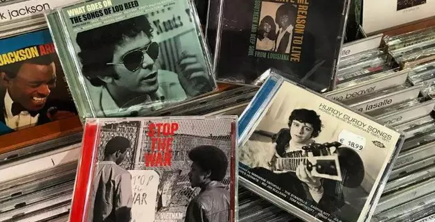
The famous American singer Tony Bennett recalled that in the 1950s, album covers made listeners feel like they were holding something unique in their hands, combining music and art. These words are still relevant today: the cover still plays a key role in the perception of a music release, complementing and enhancing the impression of the songs themselves. The concept of “album” entered musical usage at the beginning of the 20th century, shortly before the First World War. At that time, music was released on shellac discs, which were sold in thick paper envelopes. Special attention was not paid to the design back then – the covers usually contained the artist’s name, the title of the record and a simple image. Sometimes records that played at 78 rpm were packed in leather books reminiscent of photo albums, which gave rise to the term “album”.
The first colorful illustrated album covers appeared in the 1930s, when the work of artist Alex Steinweiss, who designed albums with music by Beethoven and popular singer Paul Robeson, led to a significant increase in sales. These changes in design were made possible by the transition to vinyl records, which played at 33⅓ rpm, which allowed more information to be stored on a single record.
Previously, 78-rpm discs were packed in sleeves made of rough paper, which could damage their surface. The transition to vinyl required a more careful approach to packaging, and records began to be placed in cardboard sleeves, which were ideal for applying illustrations. Thus, album design became an important task for musicians and labels, and soon finding talented artists became an integral part of the process of creating a release.
One of the first albums whose cover attracted the attention of a wide audience in the United States was Nat King Cole’s The King Cole Trio. The abstract image of a double bass, guitar, and piano with a crown not only attracted public interest, but also contributed to a significant increase in sales. In March 1945, this album took first place on the Billboard Best Selling Popular Record Albums chart and held this position for almost the entire year. The success of this release showed that the cover can significantly affect the perception of an album and its commercial success.
In the 1950s, with the rise of jazz, album covers were designed in an avant-garde style. Jazz, being music for intellectuals, was accompanied by complex and intricate illustrations, and labels created entire art departments, competing with each other in originality and creativity. In the 1960s, when rock and roll came onto the scene, the emphasis in design shifted to photography, and album covers began to be decorated with bright and unusual photos of musicians. Creating photographs for covers became an important part of marketing.
By the 1970s, album covers had become more daring and provocative. Some artists preferred simple but provocative images, while others turned to artists with an unconventional vision. This era saw the emergence of such iconic covers as The Rolling Stones’ “Sticky Fingers,” The Clash’s “London Calling,” and Andy Warhol’s “The Velvet Underground & Nico.” The yellow banana on a white background became an iconic symbol, and the first batch of records even had an interactive element — a sticker that could be peeled off to reveal a pink banana. This experimental approach, although expensive to produce, was a shining example of how art and music could enrich each other.
By the 1980s, the issue of album art had become more complex. Artists realized that success required more than just good music; They needed unique visuals that would set them apart from other artists. This was the time when logos and branding began to be used heavily and became an important part of a band’s identity. Bands like Chicago, Led Zeppelin, Def Leppard, and Motörhead became icons not only for their music, but also for their recognizable symbols and merchandise.
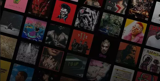
Although album covers no longer play the same sales role as they once did, they remain an important part of a music release. In the digital age, where music is consumed online, the cover has become an element of the marketing strategy, along with music videos, merchandise, and photo shoots. Visuals have become simpler and more stylish, often going back to the basics—an image of the artist and the title of the release. However, despite the changes, the cover still serves as an important tool for creating a first impression of the music.
Despite the changing format of music consumption, listeners’ interest in details about a release remains high. This interest has given rise to the emergence of a “digital booklet” – a large PDF file that can be downloaded along with the release. Such a booklet contains information about the tracks and the recording participants, active links to social networks and media, photographs, and sometimes even advertising.
What should an album cover be like?
First impressions play a key role in the music industry. The way you present your music online, even before listeners play your tracks, can be a decisive factor in attracting attention to your work. For many people, album cover is the main criterion when choosing music on streaming platforms and in online stores. The more interesting and original the design, the higher the likelihood that your release will be noticed and listened to.
Of course, it is impossible to please everyone, but you should not complicate the process of thinking about what your album cover should be. Start by analyzing album art in your genre to see what styles are popular and what works best for your music. If you’re having trouble coming up with ideas, try the following:
- Look at album art by artists who have a similar style or vibe to you. Consider what you find appealing and what you don’t like about the art. This will help you formulate your own vision for the artwork;
- Explore artist and designer blogs on platforms like Dribbble, Behance, and DeviantArt. Also, use Google Image Search to find inspiration and see what’s trending;
- Analyze what’s popular in your genre and what visual trends are dominating the music industry. This will give you an idea of what design elements can make your album cover relevant and memorable.
Don’t be afraid to borrow ideas or reach out to artists and designers directly. Maybe one of them will respond and help you create a unique artwork for your release. If you want to make the cover yourself, use the principles you identified when studying the art of other artists. This will allow you to create a visual image that will harmoniously complement your music and attract the attention of listeners.


